A name identifies a Brand Kit element, but it does not tell you when to use it. "Logo alt" and "Accent 2" mean something to the person who created them, and little to anyone else who reads the Brand Kit afterwards.
Media and color elements now take an optional description: a free-text string that explains what the element is for.
{"media":[{"name":"Logo","mediaId":"df9c3576-f9ee-4c0e-bfdd-37e2f69da230","description":"Primary logo, for light backgrounds"}],"colors":[{"name":"Accent","type":"cmyk","description":"Accent color, reserved for calls to action"}]}
Two things to know:
A description belongs to the element, not to the theme. You set it on the default theme, and every theme of the Brand Kit shares it, so "Primary logo" means the same thing on the master brand and on every sub-brand. Editing a description through a non-default theme returns 400 Bad Request.
It is optional. Existing Brand Kits keep working unchanged, and elements without a description return none.
The Brand Kit endpoints of the Environment API accept and return descriptions. See Elements for how descriptions fit into a Brand Kit.
What's next
Descriptions give AI-driven features the context that a name alone does not carry, so that GraFx Genie can pick the right media item or color for a given design. That is not available yet.
External data used to mean one thing: an Output data source, iterated row by row to produce a batch. That is right for variable data printing, but not for one person making one piece of content.
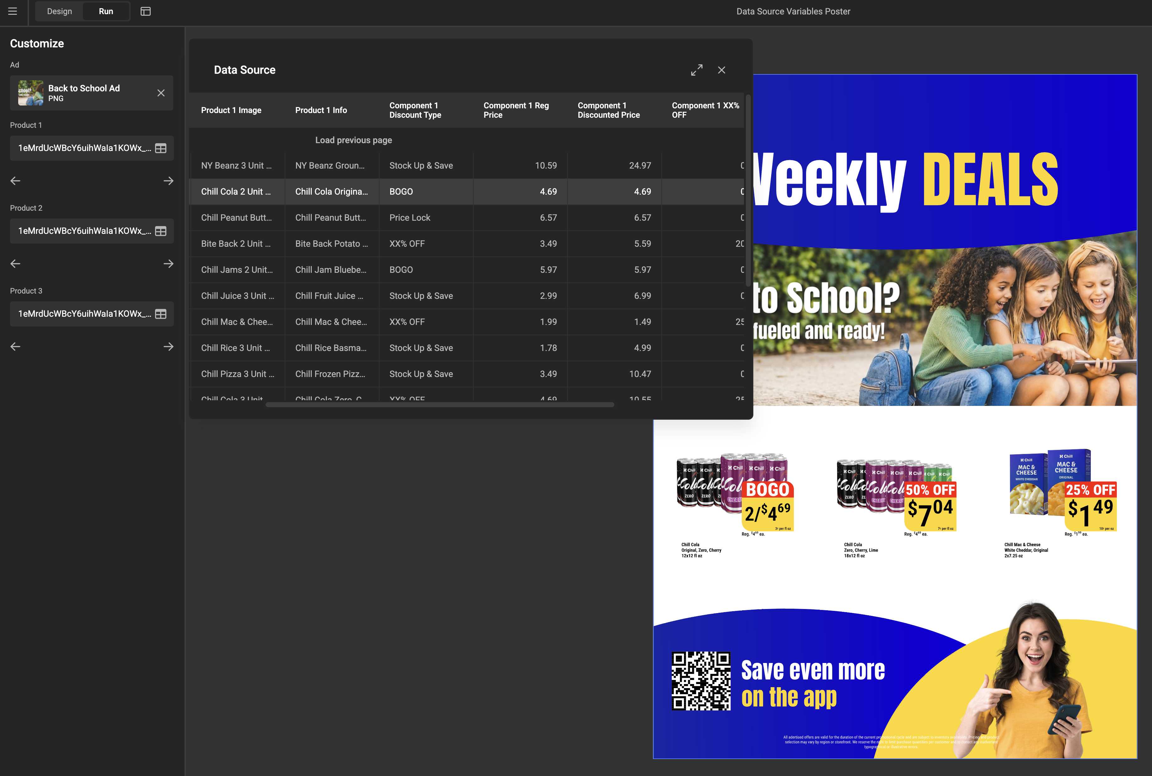
The new Data source variable type closes that gap. It connects to your data system — a PIM, a CRM, an ERP — and presents it as a table the end user selects a row from. The selected row is preserved, and the template reads its columns like any other variable value.
Data source variables work only with components
A selected row reaches the design by being mapped to the variables of a component placed in the template. There is no way to feed a data source variable into a text or image frame directly.
Records reach the variable in one of two ways: pulled live from a data connector, or pushed in by an integration at runtime. Connectors must explicitly support this use case, so an existing one may need a small addition first — see Data Connector Fundamentals. The end user browses those records either as a full table or as a simple dropdown.
The batch feature previously called Data source is now consistently called Output data source, everywhere in the UI. It is unchanged. Both work with a table of many rows; the difference is what happens to them — an Output data source iterates through all rows to produce a batch, while a data source variable preserves the one the user selected.
Component variables can now be mapped straight to the columns of a data source variable, so one record fills an entire component in a single step — a product card taking its name, price, and image from the chosen row. See Use components in a template.
Variables that exist purely for internal plumbing used to clutter the parent template's mapping list. A new Available for mapping toggle on a component variable controls this. It is on by default, so nothing changes for existing components.
Brand Kit sync keeps a template aligned with its source Brand Kit, but until now every template decided for itself whether that happened automatically.
Environment Settings › General now has a Brand Kit sync settings card with one toggle, Automatically update templates when Brand Kits change. It is on by default, matching how every environment behaves today. Switch it off and newly imported Brand Kits no longer sync automatically, and individual templates cannot opt back in. Manual sync is unaffected either way, and the setting is also available to integrations through the environment settings endpoint.
Snapping when centering the POI. Dragging the Point of Interest toward the middle of the Subject Area now snaps to it, with dotted guides shown only when aligned. See Set the Subject Area & POI.
Previews update while you drag, in both GraFx Studio and GraFx Media, instead of only on release.
A cleaner properties panel. The Subject type dropdown on an image frame is hidden when the environment defines no subject types beyond Default. See Select a Subject type.
Component resize mode is inheritable. A layout override is marked in the usual warning color and resets like any other property. Default is Scale.
Faster editor loading. The editor no longer waits for every font to load; unused fonts are fetched on demand. Output is unchanged.
Superscript and subscript follow the font. As announced in July, they use each font's own size and offset rather than a fixed style, so appearance may change.
No forced break between variables. Adjacent variables in a text frame no longer create a guaranteed line-wrap point in view mode.
A signal when the end user finishes editing a frame. In project mode, the SDK emits an event once a frame has been resized, rotated, cropped, or its text changed, after any triggered actions resolve.
Colors and Brand Kits. The picker no longer shows the wrong state after switching a color from CMYK to RGB or HEX. Theme colors edited in a template sync back correctly, the sync flag no longer reports a sync that never happened, and Smart Crop data refreshes when a theme change swaps a frame's asset.
Text frames. The loading indicator is shown again while content loads. Allow inline text editing no longer redraws the frame with an overridden maximum height, which could shift layouts combining copyfitting and auto-grow.
Components and actions. A component whose variable rules fail no longer crashes; default resize mode is correct again; action loops are reliably detected; resetting a layout animation override returns its duration.
Output. Strokes on image frames are visible in PDF output, and an invalid image is reported as an in-flight error for its record instead of failing the whole job.
Interface. The animation reset block design is corrected.
Connectors that use OAuth 2.0 Authorization Code authorize each user individually: the first time you open a template that reads from such a connector, you sign in to the external system yourself, and CHILI GraFx keeps that authorization session for you. Until now that session could not be cleared — the only way to start over was to delete and republish the Connector, which affected every user of it.
A new endpoint ends the calling user's own authorization session for a Connector:
POST /api/v1/environment/{environment}/connectors/{connectorId}/auth/oauth-authorization-code/logout
The next time that user accesses the Connector, the sign-in flow runs again. This is useful when you need to connect as a different account in the external system, or when a session no longer works and you want to re-authorize cleanly.
Two things to know:
It only affects the user making the call. The session is resolved from the access token, so other users of the same Connector keep their own sessions. There is no way to sign out on someone else's behalf.
It requires a user token. Any user with access to the environment can call it. Integration (machine-to-machine) tokens are rejected, because OAuth 2.0 Authorization Code sessions belong to a person rather than to an integration.
See Authorization for Connectors for the details, and how OAuth 2.0 Authorization Code fits into the wider connector authorization model.
A new version of the Connector CLI — the command-line tool used to develop, configure, and manage CHILI GraFx connectors — is available. This release is about the local debugger, and about closing the gap between how a connector behaves on your machine and how it behaves once published.
When you invoke a connector method in the debugger, most of what matters happens out of sight: how long the method took, and which external requests it made along the way. Until now the debugger showed only the end result, so a slow query or an unexpected extra round-trip was hard to spot.
The debugger now shows an Execution metrics panel alongside the output. For every method you invoke, it reports whether the call succeeded or failed, how long it took to complete, and a record of every outgoing fetch — including the URL and the time each one took. If a method made no external calls, the panel says so explicitly, which is a quick way to confirm a caching or short-circuit path is working as intended.
Two smaller changes to the result panel: errors are now visually distinct from successful responses, and the formatted JSON output can be copied to your clipboard in one click.
Testing a method that takes an asset ID — such as detail or download — usually means running query first and copying an ID out of the result. Because that result is rendered as JSON, the value you copy tends to arrive with its surrounding quotes or braces attached, and the method then fails on characters that were never part of the ID.
Fields in the debugger that expect an ID now normalize what you paste, extracting the ID itself and discarding the JSON around it.
The debugger recompiles connector.ts whenever you save it and reloads the browser tab. This is no longer something you opt into — watch mode is always active when you run connector-cli debug, so the edit-and-refresh loop works without any extra flags.
Compilation problems are also reported more consistently, so a TypeScript error is raised as an error instead of leaving you debugging an out-of-date build.
Connectors that need to pace themselves — polling an external job until it completes, or backing off after a rate-limit response — use the global sleep(ms) helper to pause between requests. That helper was available in the connector runtime but not in the local debugger, so any connector using await sleep(...) failed under connector-cli debug even though it ran correctly once published.
The debugger now provides sleep(ms) as well, bringing it in line with the runtime. Polling and back-off logic can be tested locally instead of only after deployment.

PDF output settings now support converting RGB colors to CMYK during export. Templates often contain RGB content — photos from a DAM, or colors defined for screen — and this new option brings that content into your print-ready color space, as a complementary step to the CMYK conversion:
Enable it in your PDF output setting — switch on Convert RGB colors to CMYK colors in the Color management section. The switch becomes available once the intended and target CMYK profiles are set, since RGB colors convert to the same target CMYK profile — see the PDF output settings guide.
Pick an RGB source profile — RGB colors with an embedded profile are converted using that profile; for unmanaged RGB colors, choose the assumed source profile (such as sRGB IEC61966-2.1 or Adobe RGB (1998)) from the dropdown that appears.
For Environment API integrations, postProcessing.colorTransformation accepts two new properties: convertRGBColors (optional, default false) and intendedRGBIccProfile (required when convertRGBColors is true):
{"postProcessing":{"colorTransformation":{"intendedIccProfile":"ISO Coated v2 (ECI)","destinationIccProfile":"Coated GRACoL 2006 (ISO 12647-2:2004)","convertRGBColors":true,"intendedRGBIccProfile":"sRGB IEC61966-2.1"}}}
What is changing: Many fonts include their own instructions for how
superscript and subscript characters should look — how large they are and how
far above or below the baseline they sit. Until now, GraFx Studio ignored those
instructions and applied a single fixed style to all fonts. From GraFx Studio
1.46.0, superscript and subscript text follows the settings built into each
font.
What this means for your templates: Superscript and subscript text may
render at a slightly different size or position than before. Normal (baseline)
text is unaffected, and content, fonts, and layout are otherwise unchanged.
Because most fonts define these settings, templates that use superscript or
subscript will generally see some change. How noticeable it is depends on the
font — from barely perceptible to clearly visible — so it's worth reviewing any
template where the appearance of this text matters.
Visual changes possible
If your templates use superscript or subscript text, its size and vertical
position may change after this update. How noticeable the change is depends
on the font and the design, so we recommend reviewing templates where the
appearance of this text matters before adopting the new version.
The most reliable way to see the impact is to compare your own templates before
and after the update:
Identify the templates that use superscript or subscript formatting. This
formatting is common in trademark and registered symbols, footnote markers,
ordinal numbers (1st, 2nd), prices with raised cents
($1999), units of measurement (m2, cm3), and
chemical formulas (H2O, CO2).
Before updating, export each of the identified templates to PDF or image
on your current version and keep the output as a reference.
After updating to 1.46.0, export the same templates again.
Compare the before and after output and confirm the superscript and
subscript text still looks acceptable.
Where the appearance has changed in a way you are not happy with, adjust the
template on the new version — for example, the font, the text size, or the
surrounding layout — until the result meets your needs.
Rolling back a version
As long as a template has not been saved on the new version, you can roll
back to an earlier version. See
Manage environment version
for the steps.
Testing on a live environment
If you are testing on a live environment, changing the version could mean
that end-user projects are saved in the newest version. Check with your
integration team, or contact our support team to discuss options.
Source of the metrics: GraFx Studio now reads the superscript and
subscript values from the font's OS/2 table — the horizontal and vertical
size (ySuperscript/ySubscript X and Y size) and the vertical offset
(Y offset) — and applies them when laying out the text.
Previous behaviour: Before 1.46.0, these values were ignored. Superscript
and subscript were drawn at a single fixed scale and offset derived internally,
regardless of the font.
Fallback: If a font leaves these OS/2 values unset (zero), GraFx Studio
keeps the previous default behaviour for that font. In practice almost all
fonts define them, so the fallback rarely applies.
Two things can shift: Both the size and the vertical position now
come from the font. Size is no longer forced to be uniform, so superscript and
subscript glyphs can be scaled slightly differently in width and height than
before.
Possible reflow: Because the size of superscript and subscript characters
can change, the width they occupy can change too. In tightly fitted text
frames, this may nudge the surrounding text slightly.
A Brand Kit can now carry variations of your visual identity through themes. Every Brand Kit has a default theme with the complete set of elements; additional themes inherit everything and override only what differs — a sub-brand accent color, or a print palette in CMYK.
Manage themes in GraFx Brand Kits: create, rename, and delete themes from the new theme bar on the Brand Kit detail page — see Manage themes.
Switch themes in GraFx Studio (Studio + Engine 1.45): the Brand Kit panel's new theme selector updates every Brand Kit element used in the template, and sync is theme-aware — see Switch themes.
Switch themes programmatically: new Actions helper functions getActiveThemeName() and switchTheme(name), or the equivalent Studio SDK methods — see Switch themes with Actions or the SDK.
Heavy media assets no longer fail prematurely — Studio now waits as long as GraFx Media may need (up to 10 minutes) to process an asset before giving up.
Font previews got an additional fallback, so previews render in more cases.
Undo and redo in text editing behave more predictably.
Subject type fallback on asset details — when a custom subject type has no settings of its own, the settings from the default subject type are now used.
Long layout and variable names are now easier to read in their panels.
Fixed 413 Content Too Large errors on output requests for large documents: the 10MB size limit now applies only to the variables property instead of the entire request body, so projects built on big templates download reliably again. See the Output API limitations for details.
When a connector calls an external system, CHILI GraFx routes the request through a server-side proxy that forwards your request headers — including the connector's Authorization header — on to that system. This is usually what you want, but some upstreams hand back pre-signed URLs (for example a CDN link that already carries its own authentication in the query string). Forwarding the connector's Authorization header to those URLs can cause the request to be rejected, so the asset fails to load.
You can now tell the proxy to drop specific headers on a per-request basis using the new X-GraFx-Proxy-Exclude-Headers request header. Provide a comma-separated list of header names, and those headers are removed from the outbound request before it reaches the external system. Header names are matched case-insensitively, surrounding whitespace is trimmed, and the X-GraFx-Proxy-Exclude-Headers header itself is never forwarded.
For example, to stop the connector's Authorization header from being sent to a pre-signed CDN URL:
X-GraFx-Proxy-Exclude-Headers: Authorization
This is supported on both the GET and POST connector proxy requests. It makes connectors that rely on pre-signed media URLs — such as the Aprimo connector, which serves assets through time-limited signed URLs — work reliably, without the proxy interfering with the upstream's own authentication.
Smart Crop is GraFx Studio's AI-powered fill mode that automatically zooms and positions an image inside a frame so the most important part stays in view, based on the image's Subject Area and POI (Point of Interest) — detected automatically by GraFx Genie. This release is a major upgrade:
A more predictable algorithm. The new version needs far less trial-and-error. It always fills the frame with no empty edges, always keeps the POI inside the frame's Subject Position, and fits as much of the Subject Area as it can — only cropping in as a last resort.
Subject alignment. A new setting nudges the subject toward any side of the frame's Subject Position instead of always centering it, so a subject can hug a layout edge and stay there across different aspect ratios.
Automatic versioning. Each frame keeps the version it was built with, so existing templates render exactly as before — and a "New smart crop available — apply it" prompt upgrades a frame to the latest algorithm in one click.
Five live previews. The asset details panel now shows five preview aspect ratios instead of three, in both GraFx Media and the Studio workspace, making it easier to set the right Subject Area and POI.
You can now map a component's image variable to a template's single-select list variable, giving template designers a more flexible way to drive component imagery from list-based choices.
Text frames can now use auto-grow and copyfitting together — a frame can both expand to fit its text and scale the text to stay within limits, a combination that previously meant choosing one or the other.
The Layouts and Pages tabs now stay visible for every layout intent, including animation and digital static layouts, so navigation is consistent no matter what you are designing.
The linear gradient color picker has been reorganized — the Colors/Custom toggle now sits below the gradient bar — making gradients easier to read and adjust.
When you add a component that contains a missing font, GraFx Studio now shows an error dialog right away, so you can resolve the font reference instead of running into a silent failure.
Working with connectors is now cleaner in two ways: unused connectors are automatically removed from a document when you save it, and connector mapping offers expanded options for how a data source maps into your templates.
Selecting a layout no longer makes the Layouts panel jump back to the top. The override dropdown list is sized correctly again, after becoming too narrow for its reset options. The interface now refreshes properly when you undo switching a variable, a template keeps its correct name after a "Save as", and the character-limit field once again accepts its maximum value.
We fixed three text issues: incorrect letter tracking when combined with a stroke, a glyph that was placed in the wrong position for a specific font, and a separate font that rendered incorrectly.
An image on the canvas now updates immediately after a Brand Kit sync, and copying and pasting an anchored frame onto a different page works correctly.
All requests now go through the authentication refresh mechanism, reducing unexpected failures during long sessions, and the SDK's image-upload staging call now handles token expiration gracefully.