How to use Brand Kits in a template
- Create your Brand Kit in the GraFx Brand Kit application
- Import a Brand Kit in your GraFx Studio Document
- Use the Media, Fonts and Styles in your document
Import a Brand Kit
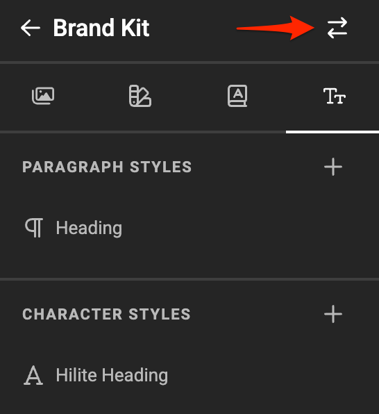
In the Brand Kit panel, click the Import Icon
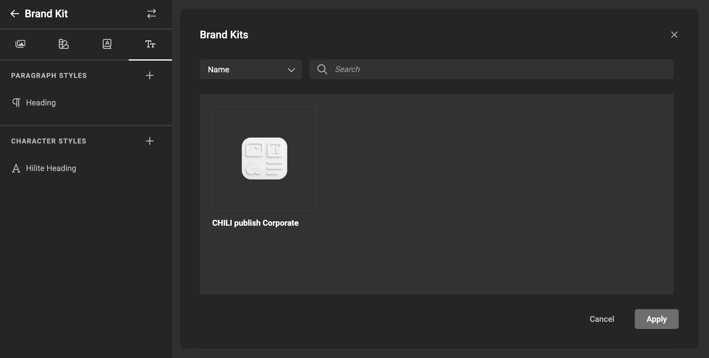
Choose the Brand Kit you created
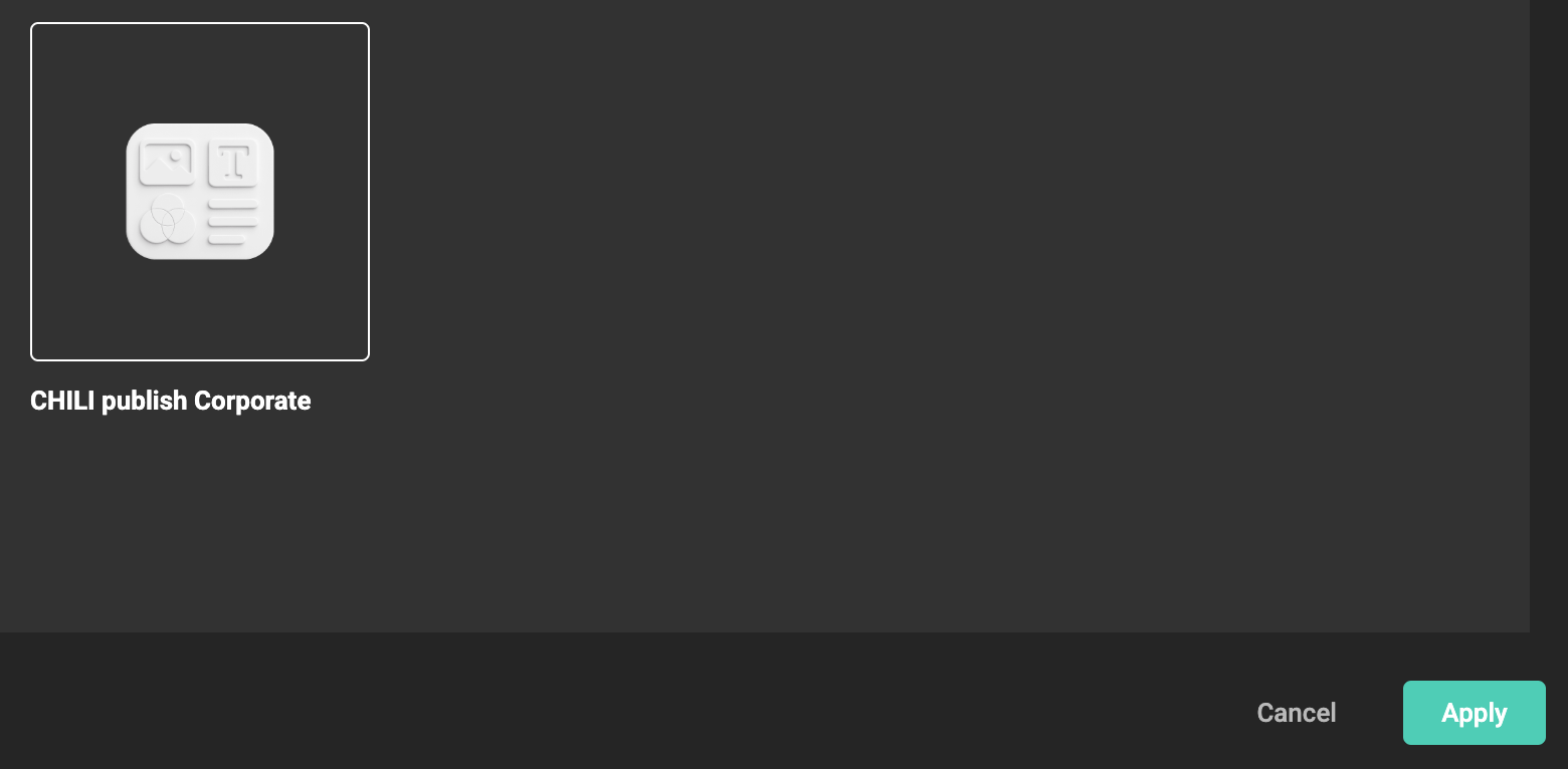
Click Apply
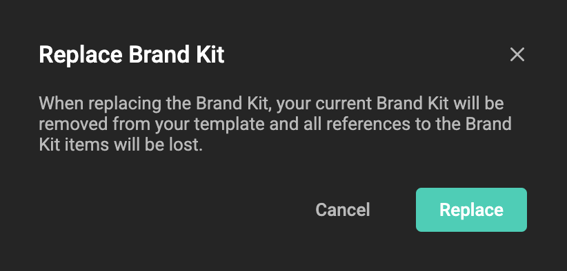
Confirm, since your Brand Kit elements will replace the current definitions in the document.
You are now ready to use your Brand Kit elements in your Document.
Switch themes
If the Brand Kit has themes, the Brand Kit panel shows a theme selector. When you open a template, the default theme is selected.
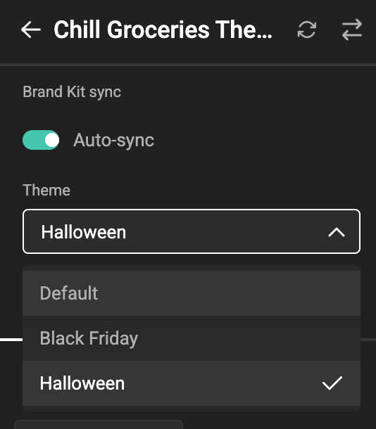
Switching to another theme updates every Brand Kit element used in the template — colors, text styles, and media — on the canvas and in the property panels. A color swatch using the Brand Kit color "Primary" shows the value of the active theme; text styles and media from the Brand Kit follow along.
Structure is managed on the default theme
Adding, renaming, removing, or duplicating Brand Kit elements is only possible on the default theme. On a non-default theme these controls are disabled or hidden, and an info icon in the panel explains this. To add an element to a theme, add it to the default theme first — the theme inherits it, and you can then override its value.
The Brand Kit's font list is shared across all themes — by design, a theme does not add or remove fonts. To use a different font in a theme, override a paragraph or character style: styles can use a different font from the shared list per theme.
Switch themes with Actions or the SDK
Themes can also be switched programmatically — for example, switching to a Print theme when the layout changes. Two Actions helper functions are available:
Integrations can use the equivalent Studio SDK brand kit theme methods.
Keep a Brand Kit in sync
Once a Brand Kit is imported, the template can stay aligned with the source Brand Kit in GraFx Brand Kits. When an element is updated centrally (for example a new brand color, or a revised paragraph style), those changes can be pulled into the template without re-importing.
Sync is controlled from the Brand Kit panel header, which now surfaces three controls next to the Brand Kit name: the Brand Kit selector, the manual sync button, and the auto-sync toggle.
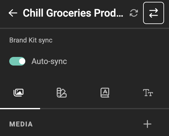
The Brand Kit selector (the swap icon) lets you switch the template to a different imported Brand Kit.
Auto-sync
The Auto-sync toggle controls whether the template stays aligned automatically:
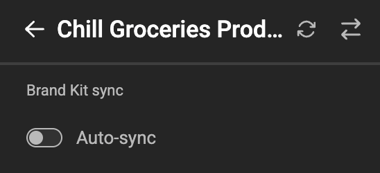
- When auto-sync is on, Studio compares the template's Brand Kit against the source every time the template is opened and every time the Brand Kit panel is opened, and applies any changes in a single step. A toast message confirms when a sync has been applied.
- When auto-sync is off, the template keeps its current Brand Kit values until you sync manually.
Newly imported Brand Kits have auto-sync enabled by default.
Auto-sync can be switched off for the whole environment
Whether templates may sync automatically is governed centrally. In Environment Settings › General, the Brand Kit sync settings card holds a single toggle, Automatically update templates when Brand Kits change:
- On (the default) — newly imported Brand Kits sync automatically, and an individual template can still switch its auto-sync toggle off.
- Off — newly imported Brand Kits do not sync automatically, and the template's auto-sync toggle is shown disabled, so a template cannot opt back in.
Manual sync is unaffected either way. Integrations can read and set this through applicationsConfig.brand_kits.features.default_sync on the environment settings endpoint.
Manual sync
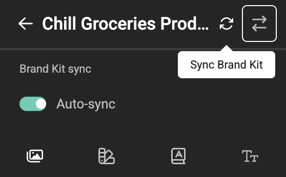
The circular-arrows button next to the Brand Kit selector pulls the latest version of the source Brand Kit on demand. Hover shows the Sync Brand Kit tooltip. Useful when auto-sync is off, or to force an update in-session after a Brand Kit change.
What a sync changes
Sync applies only the differences between the template and the source:
- New elements in the source are added to the template.
- Updated elements are replaced with their latest values.
- Removed elements in the source are not deleted from the template — existing user content is preserved.
- A renamed element is added as a new element (names act as identifiers).
A sync is a single undoable step — use undo/redo to revert it.
Sync is theme-aware: it applies to the selected theme and restores its settings to the source Brand Kit's state.