Elements
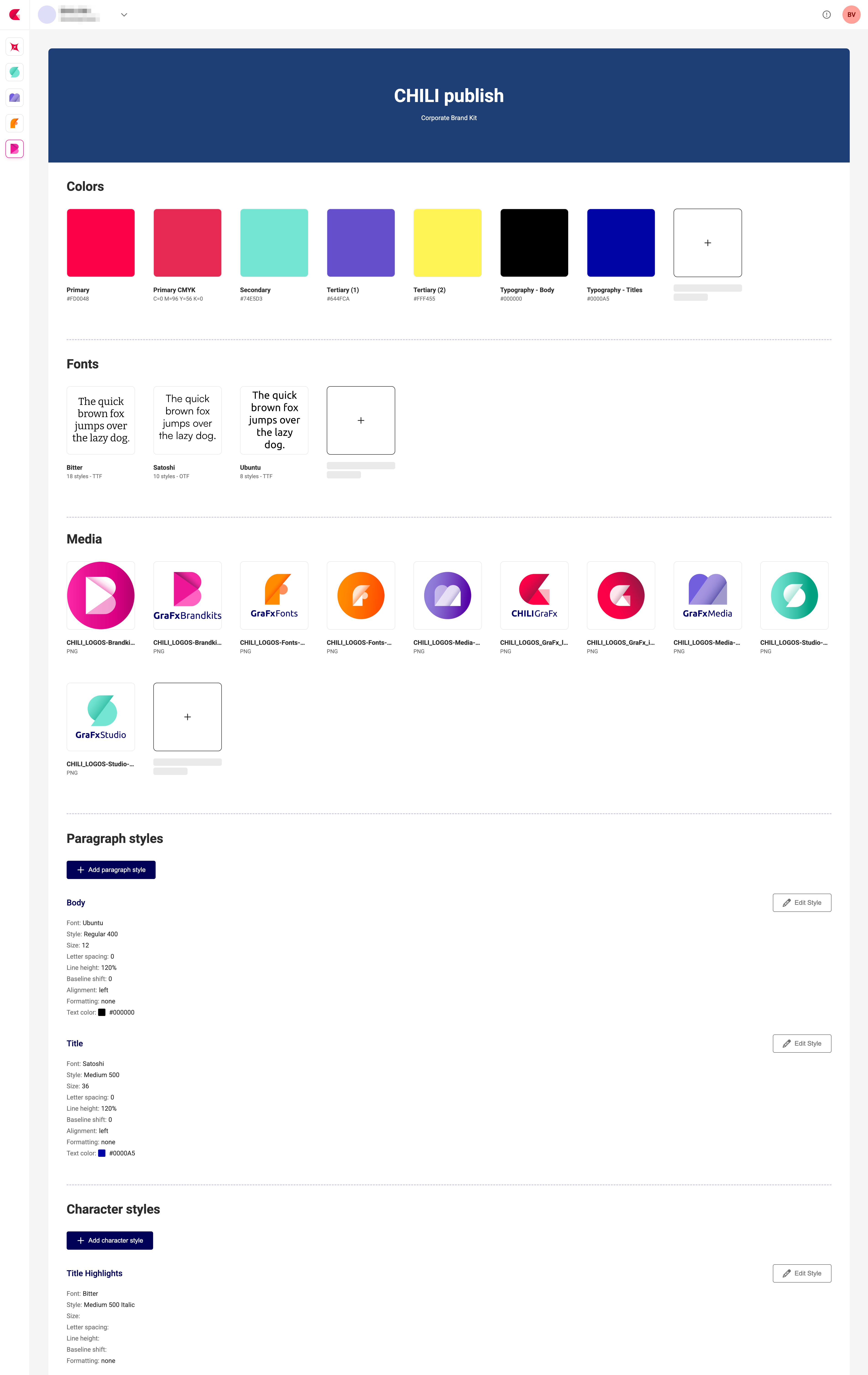
Within each Brand Kit you can manage:
| Element | Description |
|---|---|
| Colors | Named swatches (e.g. Primary, Secondary) in RGB/CMYK/HEX/... |
| Fonts | OpenType/TrueType fonts to use in GraFx Studio templates |
| Media | Logos or other image assets |
| Paragraph styles | Font, size, spacing, alignment for paragraphs |
| Character styles | Font, size, formatting for inline text |
Elements are defined on the Brand Kit's default theme and can be overridden per theme.
Brand Kit elements and design tokens
If you know design tokens from design systems: a design token is an atomic value (color.primary = #0055FF, color.primary.print = cmyk(100, 60, 0, 0), font.size.body = 16px). Brand Kit elements sit one level above. Colors come closest to tokens — named values defined once and reused — while a paragraph or character style combines multiple design decisions (font family, size, weight, line height) into one reusable style. Themes then map different values onto the same elements, much like token modes.
Design tokens (atomic values) → Brand Kit elements (styles) → Themes (value mapping) → Templates
So while we don't use the token terminology, a Brand Kit is fully compatible with a token-based design system.
Descriptions
Media, colors, paragraph styles and character styles can carry an optional description: a short, free-text explanation of what the element is for, such as "primary logo, for light backgrounds", "accent color, reserved for calls to action" or "body copy, for long-form text". A name identifies an element; a description tells you when to use it.
A description belongs to the element itself rather than to a theme. You set it on the default theme, and every theme of the Brand Kit shares it.
You manage descriptions through the Brand Kit endpoints of the Environment API.