GraFx Studio: Data Source Variables

✨ New & Improved
A new variable type: Data source
External data used to mean one thing: an Output data source, iterated row by row to produce a batch. That is right for variable data printing, but not for one person making one piece of content.
The new Data source variable type closes that gap. It connects to your data system — a PIM, a CRM, an ERP — and presents it as a table the end user selects a row from. The selected row is preserved, and the template reads its columns like any other variable value.
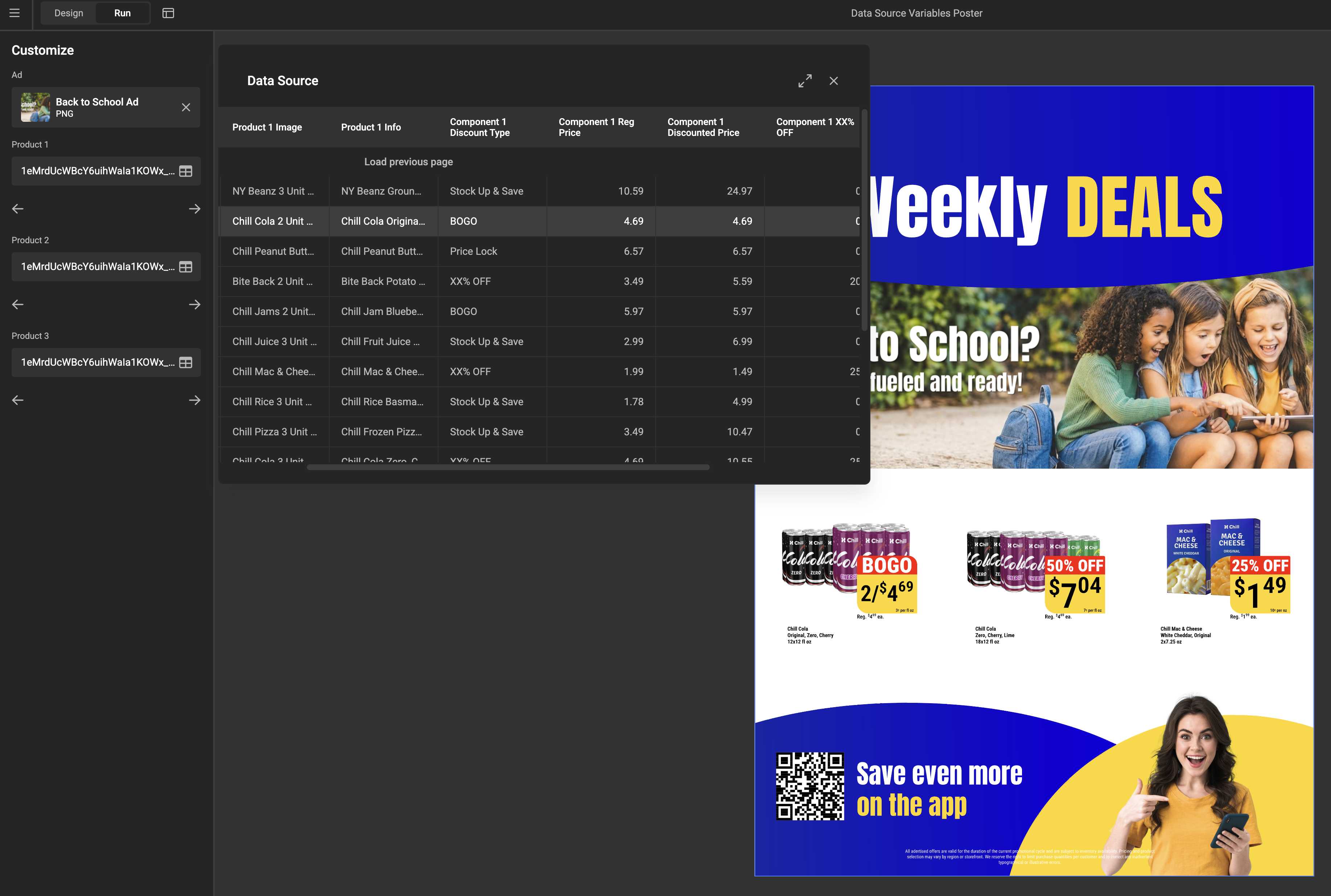
Data source variables work only with components
A selected row reaches the design by being mapped to the variables of a component placed in the template. There is no way to feed a data source variable into a text or image frame directly.
Records reach the variable in one of two ways: pulled live from a data connector, or pushed in by an integration at runtime. Connectors must explicitly support this use case, so an existing one may need a small addition first — see Data Connector Fundamentals. The end user browses those records either as a full table or as a simple dropdown.
See Data source variables for the full walkthrough.
Two features, similar names
The batch feature previously called Data source is now consistently called Output data source, everywhere in the UI. It is unchanged. Both work with a table of many rows; the difference is what happens to them — an Output data source iterates through all rows to produce a batch, while a data source variable preserves the one the user selected.
Drive whole components from one record
Component variables can now be mapped straight to the columns of a data source variable, so one record fills an entire component in a single step — a product card taking its name, price, and image from the chosen row. See Use components in a template.
Keep internal component variables out of the mapping list
Variables that exist purely for internal plumbing used to clutter the parent template's mapping list. A new Available for mapping toggle on a component variable controls this. It is on by default, so nothing changes for existing components.
Brand Kit sync, governed centrally
Brand Kit sync keeps a template aligned with its source Brand Kit, but until now every template decided for itself whether that happened automatically.
Environment Settings › General now has a Brand Kit sync settings card with one toggle, Automatically update templates when Brand Kits change. It is on by default, matching how every environment behaves today. Switch it off and newly imported Brand Kits no longer sync automatically, and individual templates cannot opt back in. Manual sync is unaffected either way, and the setting is also available to integrations through the environment settings endpoint.
🔧 Improvements
Smart Crop
- Snapping when centering the POI. Dragging the Point of Interest toward the middle of the Subject Area now snaps to it, with dotted guides shown only when aligned. See Set the Subject Area & POI.
- Previews update while you drag, in both GraFx Studio and GraFx Media, instead of only on release.
- A cleaner properties panel. The Subject type dropdown on an image frame is hidden when the environment defines no subject types beyond Default. See Select a Subject type.
Editor and text
- Component resize mode is inheritable. A layout override is marked in the usual warning color and resets like any other property. Default is Scale.
- Faster editor loading. The editor no longer waits for every font to load; unused fonts are fetched on demand. Output is unchanged.
- Superscript and subscript follow the font. As announced in July, they use each font's own size and offset rather than a fixed style, so appearance may change.
- No forced break between variables. Adjacent variables in a text frame no longer create a guaranteed line-wrap point in view mode.
- A signal when the end user finishes editing a frame. In project mode, the SDK emits an event once a frame has been resized, rotated, cropped, or its text changed, after any triggered actions resolve.
🐛 Bug Fixes
- Colors and Brand Kits. The picker no longer shows the wrong state after switching a color from CMYK to RGB or HEX. Theme colors edited in a template sync back correctly, the sync flag no longer reports a sync that never happened, and Smart Crop data refreshes when a theme change swaps a frame's asset.
- Text frames. The loading indicator is shown again while content loads. Allow inline text editing no longer redraws the frame with an overridden maximum height, which could shift layouts combining copyfitting and auto-grow.
- Components and actions. A component whose variable rules fail no longer crashes; default resize mode is correct again; action loops are reliably detected; resetting a layout animation override returns its duration.
- Output. Strokes on image frames are visible in PDF output, and an invalid image is reported as an in-flight error for its record instead of failing the whole job.
- Interface. The animation reset block design is corrected.